typography:ji lee, jop van bennekom, vince frost
Here is my homework for typography class; a presentation. I’m not uploading it here but I will give little information about my choice of graphic designers and how I chose them. At first, you may notice that I haven’t chose people that comes into mind at first- not that I knew them-.I made a research among graphic designers and as everyone would be, I found names like David Carson, Saul Bass, Stephan Sagmeister, Milton Glaser,William Caslon ,Philippe Stark, Paul Rand and a tree pages list of names that were among blogs as best graphic designers, favourite graphic designers etc.Much of them were dead and the other ones, in my humble opinion, would be the first to come to ones mind, so I decided to search for contemporary design books in my university. I searched a few than I started to look names and works. Here are my 3 graphic designers: Vince Frost, Jop Van Bennekom and Ji Lee. There are more names I found that are going to be here in another posts. And also I haven’t forgotten the bests list, I post about them too.
Here is Ji Lee on the top. I liked him being social and brave. He uses always a new way of doing things and he is also talented. You may not even be aware of him but you should take a look at his Bubble Stickers project . To me ,a graphic designer should be social,too. It’s not only a matter of talent as nowadays the works should also be funny, wise or stylish in the contemporary sense. His works seems like he is someone that you would like to work with.
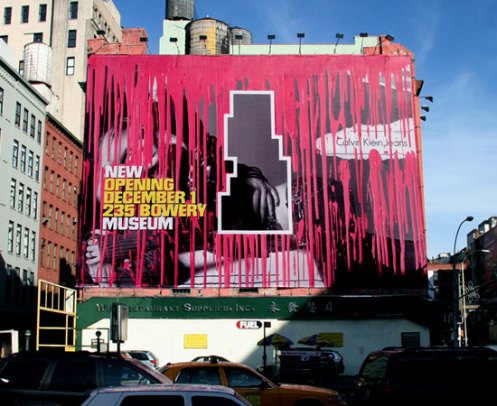
Jop Van Bennekom, a graphic designer who doesn’t want to be called as one. He is an artist, magazine-maker and he is brave. Just like Ji Lee. Actually nothing else they have in common. He has a really elegant style seems like that there is no style at all. He wants his works to look amateur but one would easily understand they aren’t. And about that stylish graphic designers thing I said I like.. Although I am not gonna be one of them, as I will study Visual Arts instead of Visual Communication Design, I love them. I don’t mean that he has its own style, his life is a style and graphic design is a part of it. He makes 3 magazines ; one men magazine, one gay magazine and an architecture magazine that I really looked for among web and couldn’t find. There are no copies of it in my country so far I saw but I keep looking to bookstores that sell international magazines.
Here is the design I loved of him at the second I saw and this design is the reason of him being in my presentation. He has more works of course and some of them are really good but he may not be in my presentation without this work. Maybe I shouldn’t have chosen him. But it is genius, isn’t it?
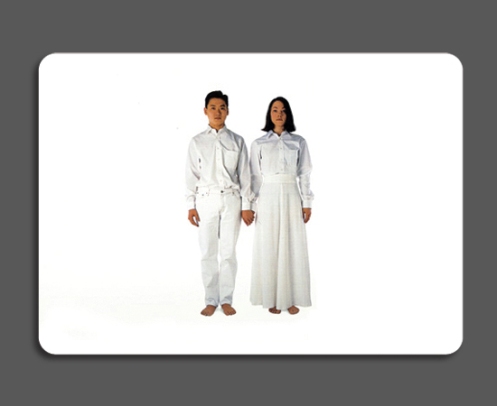
Here is something more of Ji Lee, that I didn’t include in my presentation
This is something I found genius and fun. Wedding cards.. In my country they can be really horrible designs. I am sick of that flowers and same fonts for every wedding card. People have identities and they should be seen on their life, and wedding cards are also their life. This is Ji Lee’s wedding invitation. It is the last appearence of it. It actually has a story. Ji Lee and his wife are from different nationalities and there are lots of languages talked among the invited people. So they used a way that they didn’t write anything. They sent pictures of him or her to invited people. The relatives of bride took his picture and his relatives took her picture. They couldn’t understand anything from that photos that were sent without a name and a week later this final invitation cart was sent. With signs on them telling there will be food, no animals etc.


